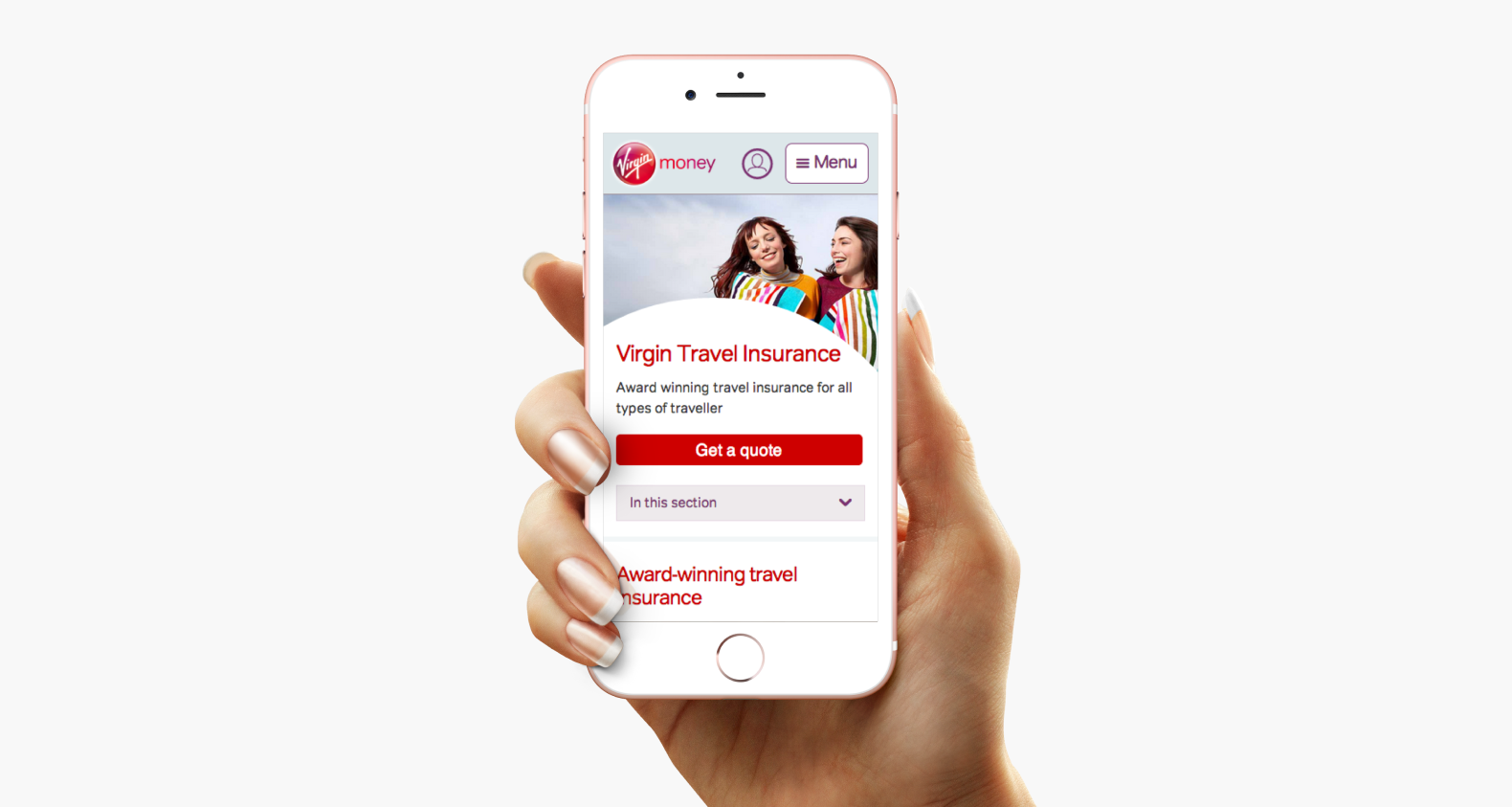
A screenshot of the Travel Insurance landing page.
I built and led the design team who designed an 'm dot', mobile-first version of the Virgin Money website. I was responsible for setting the strategic design direction, ensuring the design met the needs of Virgin Money customers and that the team followed user-centred design methods.
A screenshot of the Travel Insurance landing page.
Individual product areas of the site were run and managed by content managers with little or no design training. There was a risk that over time the quality of the site would be eroded. We used this project as an opportunity to establish a design system, to give Content Managers the tools to make changes while maintaining quality and consistency.
As we designed each area of the site, we constrained ourselves as much as possible, reusing patterns and components from other areas. Only when we couldn't reuse a component would we develop a new one. As we launched individual areas of the site and handed them over to the content editors, we published components and guidelines for use in the design system.
I worked with the digital director to develop the physical and cultural space needed for the design team to work. I created strategic partnerships among the digital and engineering leadership teams and around the business to help build and maintain a shared understanding of design for mobile and to overcome technical problems early in the design process. I implement lab-based user research sessions every Friday. The team used these sessions to test and refine and learn about our designs alongside stakeholders. With this rapid feedback from customers, the team could iterate with buy-in from all areas of the business.
This design, test, and learn approach helped to uncover gaps in product propositions. Working closely with stakeholders, and making changes based on problems identified in research sessions; we achieved increased conversions across the site. Resulting in mobile sales outstripping desktop sales in the first month the mobile site was live.
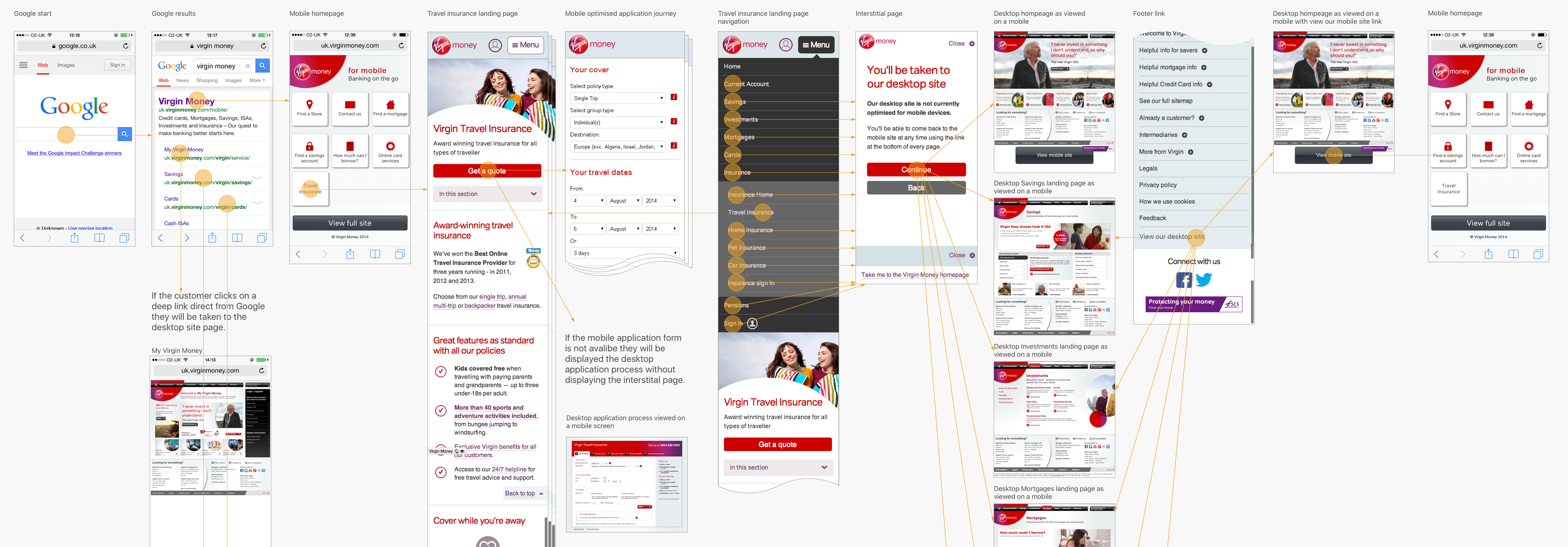
The flow of traffic on the Travel Insurance product area, showing how users would move across several different platforms.
The resulting 'm dot' site and accompanying design system set the standard for digital design at Virgin Money. The design system gave the digital team a base from which they could develop the mobile site to encompass the desktop site.
The 'm dot' site eventually became a new responsive site for Virgin Money.